The Anatomy of a Course Sales Page That Converts
Jul 29, 2026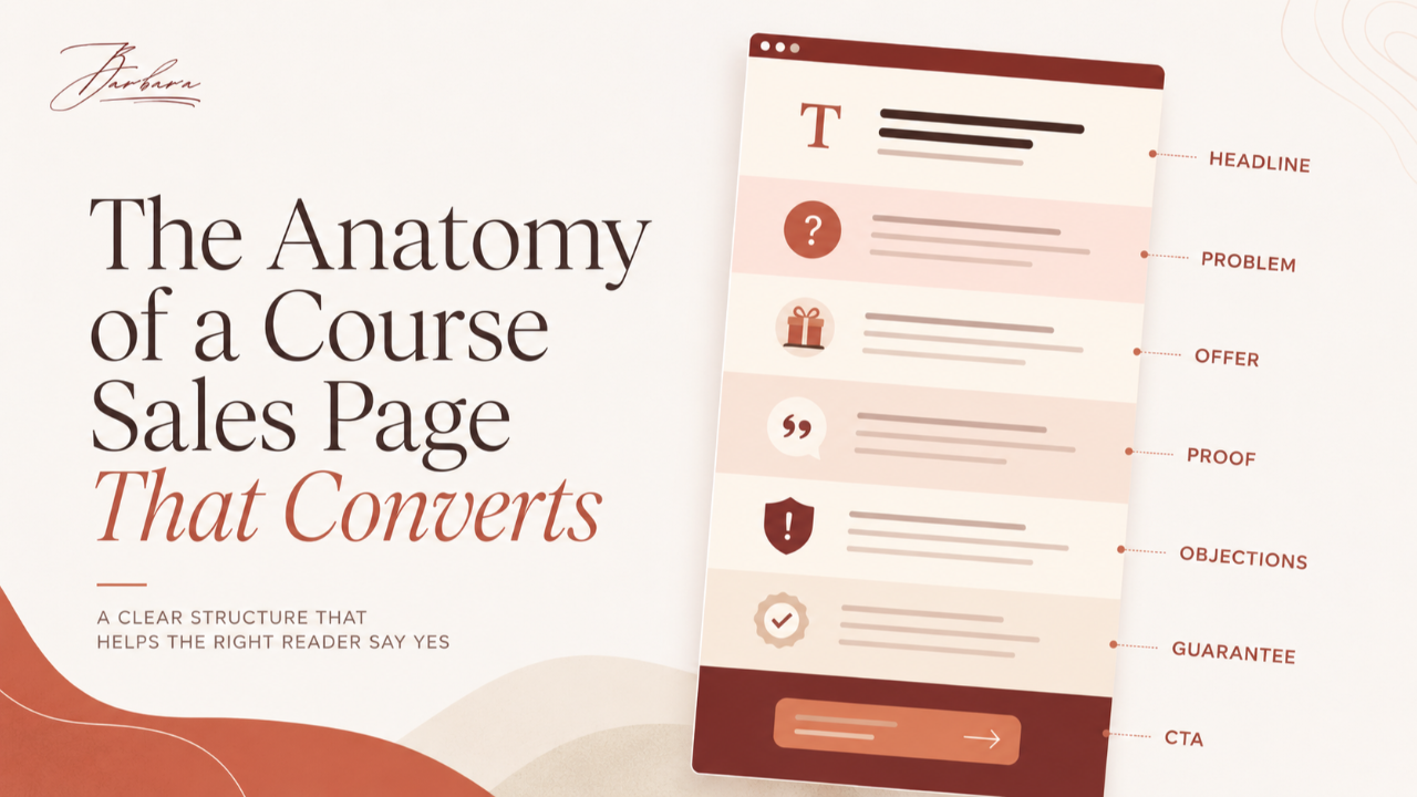
A sales page that converts confirms a decision the reader has mostly already made, rather than trying to create desire from scratch. Its job is to communicate a strong offer clearly and remove the last hesitations, in a predictable structure: a headline that names the outcome, the problem and the stakes, the offer and what's included, proof, objection handling, the guarantee, and a clear call to action. But the most important thing to know about sales pages is that the page rarely creates the sale on its own. If the offer behind it is weak or the reader arrives cold, no page structure saves it. Get the offer and the warm traffic right first, and then the page's job is small.
That last idea runs against how most people think about sales pages, so it's worth slowing down on before we get to the anatomy.
The page is the last step, not the first conversation
In the seven layers of a course business, the sales page is the fifth layer. It sits on top of the offer, the email list, the lead magnet, and the niche. That position tells you almost everything about its job.
By the time someone reaches your sales page, a lot has already happened. They found you through the right niche, opted in through a lead magnet built for them, and spent weeks warming up on your email list. They already know you, already trust you, and already want, at least a little, what you sell. The page doesn't meet a stranger. It meets someone who has been walking toward this decision for a while.
So the page's job is not to persuade from zero. It's to confirm. It makes saying yes feel obvious and saying no feel like leaving something behind. That reframe matters, because a page built to create desire from scratch is trying to do the job of four layers below it, and it will always feel like it's pushing too hard. A page built to confirm a decision the reader mostly already made can be calm, clear, and confident, because the wanting was built before they arrived. The warming that makes this possible happens on the email list, which is covered in How Email Turns Subscribers Into Buyers.
The page can't rescue a weak offer or a cold reader
Here's the most important thing to understand about this layer, and it's the thing most people resist, because it means the fix often isn't where they want it to be.
A sales page can't rescue a weak offer. A beautifully written page selling something people don't want enough at the price still fails, because the words were never the problem. And a page can't rescue a cold reader either. If the people landing on it don't know you or were never the right fit, the best page in the world converts them poorly, because the trust was never built.
This is the "offer is the skeleton, copy is the skin" principle applied to the page. The page is the skin. It can make a strong offer look its best, but it can't hold up a broken skeleton underneath. So when a page converts below what you'd expect, the honest first question is not "how do I rewrite this page." It's "is the page actually the problem, or is it the offer beneath it, or the traffic arriving at it." More often than not, it's the offer. That specific fork, page problem versus offer problem, is common enough that it has its own guide: Is It a Sales Page Problem or an Offer Problem? And if the offer is where it breaks, How to Build an Offer People Can't Ignore is the fix, not another rewrite of the page.
None of this means the page doesn't matter. It means the page matters in its place, as the final confirmation of a decision the lower layers built toward. Get those layers right, and the page has a real, winnable job. Get them wrong, and no page saves you.
The sections of a sales page that converts
With that caveat firmly in place, here is the anatomy. A sales page that converts tends to move through the same sequence of sections, each with one job. Think of them as a path that walks a already-interested reader from "I'm curious" to "yes."
The headline. This is the single most important element on the page. It names the dream outcome, in the buyer's own words, clearly enough that the right person feels the page is for them. Not the features, not the mechanism, the result they actually want. If the headline misses, most readers never reach the rest.
The problem and the stakes. Show that you understand where the reader is right now and what it costs to stay there. This isn't about twisting a knife. It's about demonstrating that you get it, which earns you the right to offer a solution. When a reader feels understood, they lean in.
The offer and what's included. Lay out what they get, framed as outcomes rather than a dry list of features. "Six modules" is a feature. "A finished welcome sequence you can turn on this week" is an outcome. People buy the outcome, so lead with it and let the features support it.
Proof. Testimonials, results, and credibility, placed to raise belief that this can work for them specifically. This maps directly to the offer's perceived likelihood of achievement: proof is how you make the dream outcome believable. Real names and real specifics outperform vague praise.
Objection handling. Address the top hesitations directly, and, where you can, handle them through story rather than a dry list of questions and answers. More on that below, because it's one of the places a page most often goes flat.
The guarantee. Remove the risk, in plain language. A clear guarantee takes the fear off the reader's shoulders and puts it on yours, and it usually lifts conversion by more than the occasional refund costs.
The call to action. One clear next step, repeated at the natural decision points. Make the yes easy: one obvious button, one obvious action, no hunting. Confusion at the call to action quietly kills pages that did everything else right.
Notice how closely this tracks the offer itself: outcome, belief, risk removal. The page isn't inventing anything. It's presenting the strong offer you already built, in the order a reader needs to hear it.
Signs the page is genuinely the weak layer, and signs it isn't
Because the page gets blamed so often when it isn't at fault, it's worth being precise about what a real page problem looks like.
It's genuinely a page problem when warm, ready people land and get confused, can't tell what's being sold, can't find the next step, or drop off before they even reach the offer. Those are communication failures, and communication is exactly the page's job.
It's not a page problem, it's the offer, when warm people who clearly understand what's being sold still decline. They got it, and the answer was no. That's the offer, not the words describing it. The full test is in Is It a Sales Page Problem or an Offer Problem?
And it's not a page problem, it's traffic or the list, when the people arriving are cold or the wrong fit. A page can only convert the people sent to it. If they arrive without trust, the leak is upstream, either a cold list or a mismatch you can trace with Do I Have a Traffic Problem or a Conversion Problem?
Diagnosing this correctly saves you from the most common wasted effort in the whole business: rewriting a page that was never the problem.
Building the page after the offer is set
Here's the sequence for building a page that converts, and the first step is the one people most want to skip.
- Start from the finished offer. Do not write the page until the offer is designed. The page presents the offer; if the offer isn't built, you're writing around a hole.
- Pull the headline from real language. Use the words your buyers actually use, gathered from their own descriptions of the problem, and the email angle that already earned the most clicks. Your inbox has been testing headlines for you.
- Lay out the sections in order. Headline, problem, offer, proof, objections, guarantee, call to action. Each doing its one job, in the order a reader needs them.
- Use real urgency only. If there's a genuine deadline or reason to act now, use it. If there isn't, don't manufacture one.
- Cut anything that doesn't move toward the one action. Every section should push the reader gently toward the call to action. If a paragraph doesn't, it's a distraction, and distractions leak conversions.
The whole page is assembled from a strong offer, not conjured to compensate for a weak one. When the offer is solid, this sequence is almost mechanical. When the offer is weak, no sequence rescues it, which is the recurring lesson of this entire layer.
Urgency and objections, done honestly
Two parts of the page are where trust is most easily won or lost, so they deserve their own attention.
Urgency must be real. A true deadline, a genuine bonus that actually expires, a cohort that genuinely closes, these create honest reasons to act now, and they work. A fake countdown timer that resets when you reload the page does the opposite. It might squeeze a few extra sales in the moment, but it teaches the reader that you'll manufacture pressure, and that suspicion bleeds into everything else on the page. Real urgency converts and keeps trust. Fake urgency borrows against it. If your offer needs invented scarcity to sell, the problem is the offer, not the amount of pressure.
Handle objections through story, not a dry FAQ. The instinct is to bolt a list of questions and answers onto the bottom of the page. That can work for genuine logistics, but for the real hesitations, the ones about whether this will work for someone like them, a short story lands far better than a bulleted answer. A brief account of someone who had the same doubt and what happened dissolves the objection by letting the reader see themselves in it, instead of arguing them out of it. Story handles objections the reader hasn't even said out loud yet.
Both of these come back to the same principle: the page earns the sale by being trustworthy, not by applying pressure. Genuine reasons and honest stories convert better than manufactured ones, and they don't cost you the trust the lower layers worked so hard to build.
Common sales page mistakes
- Writing the page before the offer is designed. You end up writing around a hole, and the page can't hide it.
- Leading with features instead of the outcome. People buy the result. Bury the outcome and you lose them before the features matter.
- Burying or omitting the call to action. If the next step isn't obvious and repeated, ready buyers slip away.
- Manufacturing fake urgency. Fake countdowns and invented scarcity cost more trust than they gain sales.
- Adding proof that doesn't address a real doubt. A testimonial that answers no actual hesitation is decoration, not persuasion.
- Asking the page to create desire the earlier layers should have built. A page pushing hard to manufacture wanting is a sign the niche, list, or offer under it did not do their job.
- Endlessly polishing a page whose real problem is the offer. The most common wasted effort of all. Diagnose before you rewrite.
Where the page sits in the system
The sales page sits above the offer and below the launch and traffic, and that position is the key to reading its symptoms correctly.
Because the page sits on top of the offer, the list, the lead magnet, and the niche, it can only confirm the desire those layers created. It cannot manufacture desire on its own. This is exactly why "my sales page won't convert" so often traces downward: to a weak offer just beneath it, to a cold list two layers down, or to wrong-fit traffic arriving at the top. The pain shows up at the page, but the cause usually sits lower, which is the whole lesson of The Symptom Is Rarely the Problem.
So when the page underperforms, resist the urge to start rewriting. Trace it. If several layers look weak, What Should I Fix First in My Funnel? tells you to fix the lowest one, which usually isn't the page. If you want the full sequence, How to Diagnose Why Your Course Business Isn't Selling walks all seven layers, and Why Is My Online Course Not Selling? is the short way in. The launch above the page is what drives a wave of warm traffic to it during a sale, and a launch to a cold list is its own common failure, traced in Why Did My Course Launch Fail?
The short version
A sales page that converts confirms a decision the reader mostly already made. It presents a strong offer in a clear structure, headline, problem, offer, proof, objections, guarantee, call to action, and removes the last hesitations with real urgency and honest storytelling. But the page can't create desire the lower layers didn't build, and it can't rescue a weak offer or a cold reader. Build it from a solid offer, structure it cleanly, and let the layers beneath it do their job.
Before you rewrite your sales page again, run the free Course Business Diagnostic to confirm the page is actually your weak layer, and not the offer beneath it.
Take the free Course Business Diagnostic
FAQ
How long should a sales page be? As long as it needs to be to communicate the offer and remove the real objections, and no longer. Higher-priced or more complex offers usually need more page, because there's more to explain and more hesitation to address; simpler or lower-priced offers can convert on a short page. Length itself isn't the lever. Whether every section earns its place is. Cut anything that doesn't move the reader toward the decision, whatever the resulting length.
Should I use a video sales letter or a text page? Either can work, and the choice is a trade-off rather than a rule. Video can build connection and carry emotion well, but it forces a pace on the reader and is harder to skim; text lets people move at their own speed and jump to what they care about. Many strong pages use both, a video for those who want it and full text for those who'd rather read. Match the format to how your audience prefers to consume, and don't assume video alone will lift a page whose real problem is the offer.
Where do testimonials go on a sales page? Near the claims they support, so proof shows up right where doubt would. A testimonial about fast results belongs beside the promise of fast results; one about ease of use belongs beside the part where someone worries it'll be too hard. Scattering relevant proof through the page, placed against the specific hesitation it answers, works better than stacking every testimonial in one block at the bottom that many readers never reach.
Do I need a countdown timer? Only if it reflects something real. A timer tied to a genuine deadline, a cart that actually closes, a bonus that truly expires, is honest urgency and can help. A timer that resets every time the page loads is fake urgency, and it costs you more trust than it earns in sales. If your offer only sells with invented pressure, the issue is the offer's strength, not the absence of a countdown. Use real deadlines; skip manufactured ones.
My page won't convert, should I rewrite it? Not yet, not until you've confirmed the page is actually the problem. Most low-converting pages are faithfully presenting a weak offer or receiving cold, wrong-fit traffic, and rewriting the page fixes neither. Check first whether warm people who understand the offer are still declining (an offer problem) or whether the people arriving were ever the right, warmed-up audience (a list or traffic problem). Rewrite the page only once you've ruled those out, because a rewrite aimed at the wrong layer is the most common wasted effort there is.